Well it was time for some cake, so baked an Apple-Cream Cheese Bundt Cake! Apple type cakes are always a delicious treat so when I found this interesting recipe I had to try it and now it is a new favorite dessert of mine. The cake itself has a wonderful taste with some ingredients like brown sugar, cinnamon, nutmeg, and toasted pecans that give it a great flavor along with both applesauce and fresh apples for an appealing apple flavor. However, the two aspects of this dessert that makes it extra yummy are the cream cheese filling and praline frosting. Praline frosting is a brown sugar base frosting so for a recipe like this the taste of the frosting works wonderful with the cake.
— —
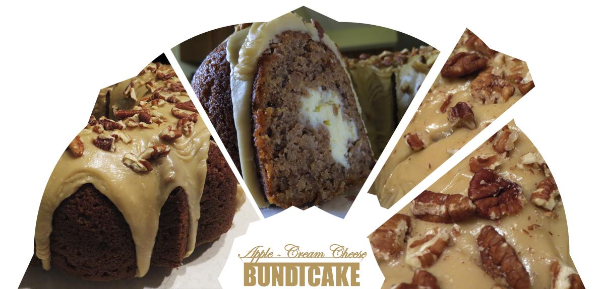
Photography this time was to focus on different parts of the dessert. So the base design layout needed three photos to work so the question began what to show in the three photos. The end result was the cake as a whole, the interior of the cake when cut so to see the cream cheese filling, and the scrumptious toppings of the praline frosting with chopped toasted pecans. These three photos showed aspects of what the dessert is and what makes it alluring for someone to want to eat it. To emphasis the bundt cake shape, the three photos appear through half of the bundt pan circular shape. A small extra to the bundt cake shape was to incorporate the action of getting a slice of cake with a slice being removed on the right side.
![]()
Apple – Cream Cheese Bundt Cake has more in terms of words and length than usual so that was the main challenge with designing this logo. The best option was grouping and a layered layout, the division in the words made the most sense with creating two groups of one being “Apple – Cream Cheese” and the other “Bundt Cake”. “Apple – Cream Cheese” describes what the specific flavor and ingredients for the cake are while “Bundt Cake” tells us what type of dessert it is. The layout was to mimic the display of a cake with “Apple – Cream Cheese” on top where the cake is located and “Bundt Cake” as part of the cake stand. The main shape of the cake stand uses the “T” in bundt as the pillar/handle piece connected to the platter. The last part for the logo design was the fonts with the top part using a handwriting type font to convey the beauty of the dessert and the bottom part a bold sans-serif font so that there was little white space between letters.