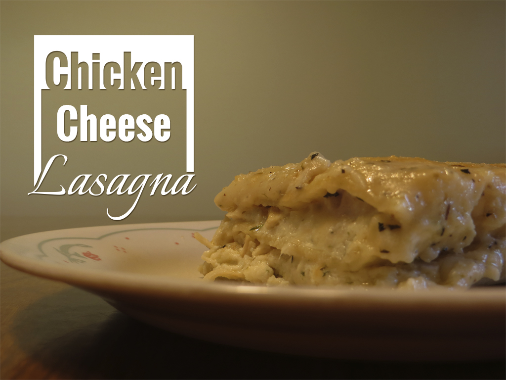
Lasagna is your main well known Italian dish that usually has Marinara Sauce, Ground Beef or Italian Sausage, Cheese Mixture, and Lasagna Noodles. The classic version is delicious and love it a lot but sometimes changing it up can be just as tasty. This version uses a White Cheese Sauce (very similar to an Alfredo Sauce) and Chicken for the sauce and meat instead so if your love your Chicken and Alfredo combination this is a great recipe to use that combination in a Lasagna. The recipe is completely homemade so sorry no using a jar of sauce to make it easier but come on when it is homemade it always taste better so worth the time and effort.
— —
A common approach for design is to keep things simple, if you do too many things or go overboard what you were trying to do can get lost. For the photograph, the Rule of Thirds is used for composition which is to align points of interest along the lines and points if the photo was divided into three both vertically and horizontally. I may not have a photo studio to create the perfect lighting and background but there is always a way. With moving things around I can create a background that works to get a good composition and use Adobe Photoshop to tweak it some to get a great photo to use. Sometimes with a little work a good or ok photo can be turned into a great photo just give it some time in a photo editor.

The logo created was using a square layout with the words formatted differently using two fonts. I choose a square layout since Lasagna is generally cut into square/rectangle shape to serve so I wanted to match that. The focus of the logo was to be similar how Lasagna is which is a layered dish with layers being different from one another since one layer will be a noodle then another meat or cheese. So that is the idea here, each word is its own layer and different from the other layers with none the same. “Chicken” was an inverse layer with a solid colored block that has the word cut out of it while “Cheese” was regular with borders to the left and right. “Lasagna” was given a hand writing type of font to make it stylized and increased in size. This logo design was to reflect the dish in both shape and composition which is of course one of thousands of ways to do it.
