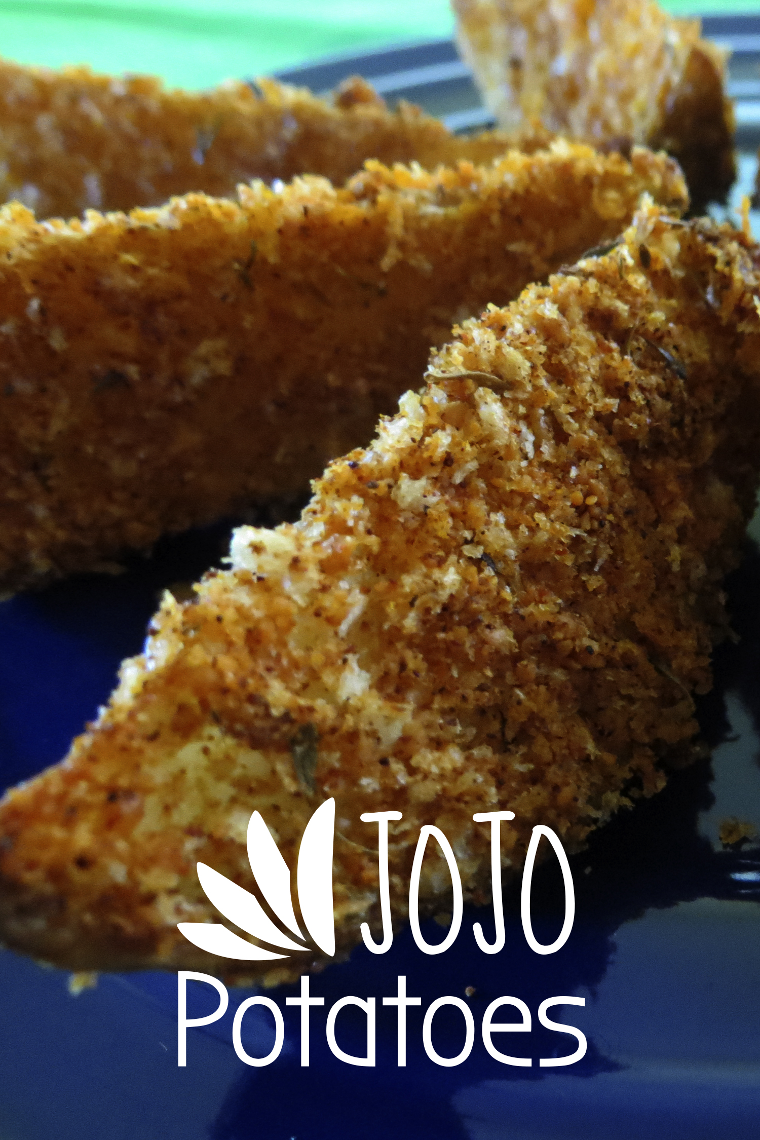
 Potatoes are probably the most common side everyone knows and is use to eating. For me, I have had potatoes in forms like mashed, baked, scalloped, fried and more so I thought it was time to look for something new. So the answer came in the form of Jo Jo Potatoes which is a type of potato wedge recipe. The potato is sliced into wedges and then breaded before baking in the oven. For the breading, it has a number of spices so the potato wedges have good flavor to it so dipping sauces are not really needed. This has become a great and tasty way to fix potatoes since it is an easy pop in your mouth finger food.
— —
Simplicity is a good direction for a logo since sometimes if too elaborate or complex can lead to confusion and a lack of understanding. For the Jo Jo Potatoes logo, the goal was a simple direct to the point kind of logo with just the text and a graphic using the shape of a potato wedge. I felt it was important to show the shape of the potatoes for the recipe since usually they can be fixed in many different ways so to give a visual cue on what to expect with this side was needed. The logo was a two layer approach with the top layer bigger and has the graphic plus “Jo Jo” while the bottom layer consist of just “Potatoes”.
![]()