Trying new cuisines from different ethnic backgrounds is a good way to explore and find something great to eat. An area of ethnicity I have been exploring is German cuisine with Sauerbraten being one of the recipes I have tried. Sauerbraten is a popular German cuisine with similarity to a beef pot roast that starts with marinating the beef a number of days and ends with serving with gravy. The dish can be a bit of an acquired taste with a sourness to it and unique ingredients not normally used in everyday recipes. Sauerbraten was a German cuisine exploration I enjoyed and something anyone looking to try a new ethnic dish should give a chance and eat.
— —
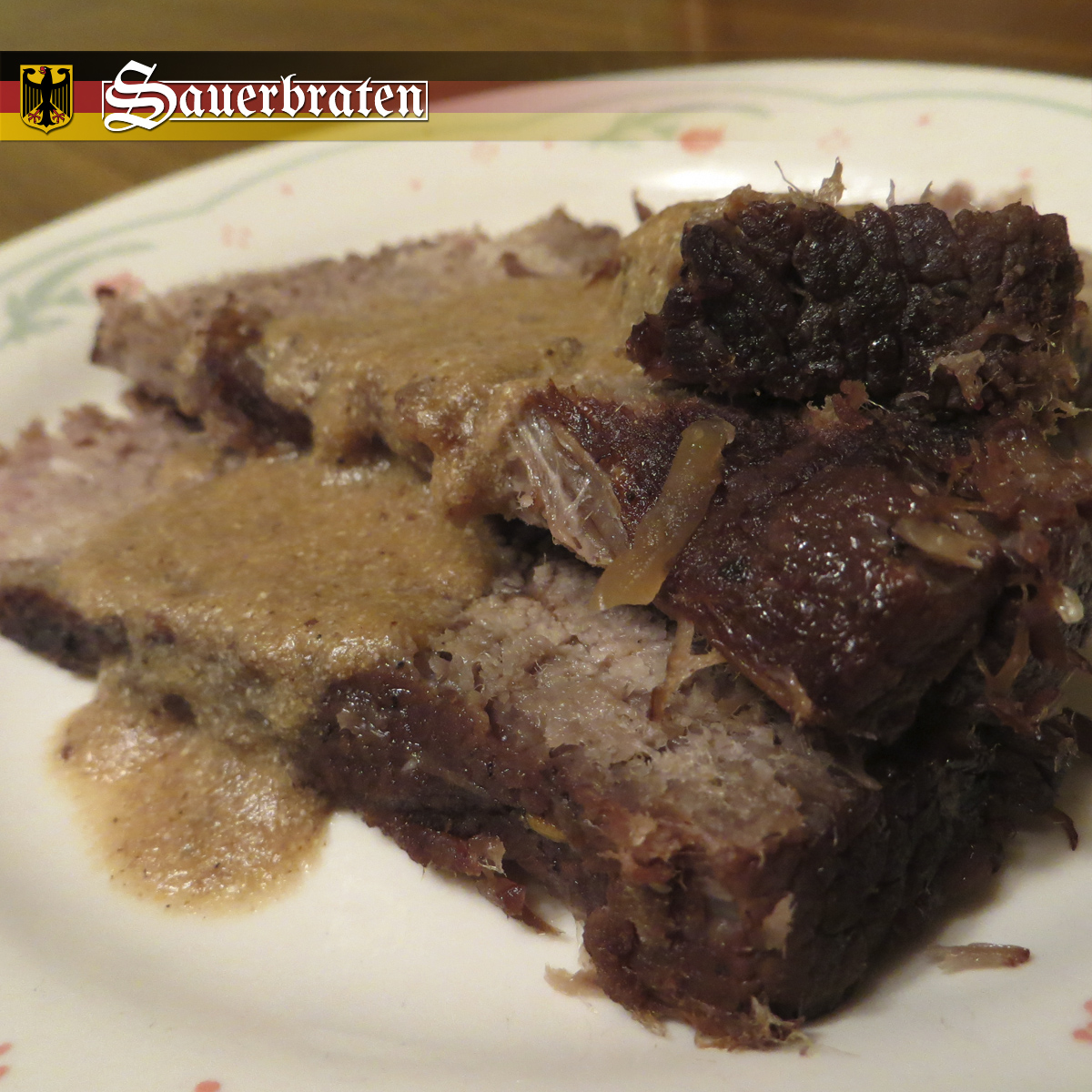
Sauerbraten as a dish is simple in nature with slices of beef and gravy. So the focus for the photograph is to show the details and texture of the food with an up close view. The photograph starts with plating so cutting three slices of beef was ideal and then top it off with the gravy going across the beef in a moderate amount. The close up side of the beef was stacked on top of one another with the far end spread out in a circular fashion. To have better focus, the photo was shot with a good depth of field so that the farther aspects of the photo have a blurriness so then the eyes are drawn to the area with more clarity. From plating to point of view to depth of field, to take a professional quality photograph it takes a number of different things to work on and think of but is always worth it in the end to take the time to plan a photograph.

Germany has a unique look and feel so it was important to properly replicate some of that in the logo. The first step for the Sauerbraten logo was to use a font that one would associate with German culture and history. So, the ideal kinds of fonts were old english text types that are serif with a sharpness at the different points of each letter. The “S” in Sauerbraten has a more decorated look since for those font types the capital first letter was generally more stylized. To give the logo a little bit more, the text was given a rectangular container with some letters breaking out so the line ends around those break points. For the logo area in the final image, two symbols of Germany were used with the background having the flag colors and layout along with adding the Germany Coat of Arms image to the left of the logo.