Cook. Photo. Eat. Design.

  • Newest
  • Posts
  • Gallery
  • About
  • Contact

March 8, 2016 By Nicholas Dapkus

Sauerbraten

Sauerbraten

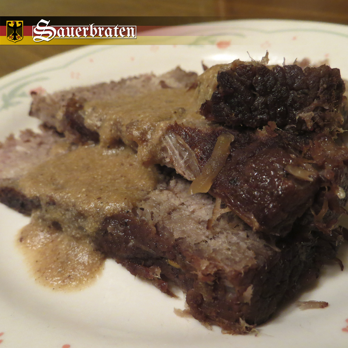
Trying new cuisines from different ethnic backgrounds is a good way to explore and find something great to eat. An area of ethnicity I have been exploring is German cuisine with Sauerbraten being one of the recipes I have tried. Sauerbraten is a popular German cuisine with similarity to a beef pot roast that starts with marinating the beef a number of days and ends with serving with gravy. The dish can be a bit of an acquired taste with a sourness to it and unique ingredients not normally used in everyday recipes. Sauerbraten was a German cuisine exploration I enjoyed and something anyone looking to try a new ethnic dish should give a chance and eat.

— —

Sauerbraten as a dish is simple in nature with slices of beef and gravy. So the focus for the photograph is to show the details and texture of the food with an up close view. The photograph starts with plating so cutting three slices of beef was ideal and then top it off with the gravy going across the beef in a moderate amount. The close up side of the beef was stacked on top of one another with the far end spread out in a circular fashion. To have better focus, the photo was shot with a good depth of field so that the farther aspects of the photo have a blurriness so then the eyes are drawn to the area with more clarity. From plating to point of view to depth of field, to take a professional quality photograph it takes a number of different things to work on and think of but is always worth it in the end to take the time to plan a photograph.

Sauerbraten

Germany has a unique look and feel so it was important to properly replicate some of that in the logo. The first step for the Sauerbraten logo was to use a font that one would associate with German culture and history. So, the ideal kinds of fonts were old english text types that are serif with a sharpness at the different points of each letter. The “S” in Sauerbraten has a more decorated look since for those font types the capital first letter was generally more stylized. To give the logo a little bit more, the text was given a rectangular container with some letters breaking out so the line ends around those break points. For the logo area in the final image, two symbols of Germany were used with the background having the flag colors and layout along with adding the Germany Coat of Arms image to the left of the logo.

Filed Under: Cook. Photo. Eat. Design.

February 18, 2016 By Nicholas Dapkus

Corn Dog Casserole

Corndog Casserole

Casseroles can be something quite delicious or questionably strange since they come in many different flavors and types. Generally, I will only try a casserole if it is based off something I like and the combination of ingredients makes sense. Corn Dog Casserole is exactly what it sounds like; the taste and flavor of a corn dog in casserole form. I always love a good corn dog so making something close to it homemade and in good size portion for many to enjoy was ideal. The casserole goes a little farther in ingredients than a regular corn dog with cheddar cheese, green onion, and celery but does not ruin the original corn dog taste. Additionally, Corn Dog Casserole is a healthier option with some vegetables in it and no deep frying.

— —

Corn Dog Casserole consist of two parts visually cornbread mix and hotdogs, so was not visually interesting. So for photography, the focus was to simply show what the casserole was made up of by using five photographs. The main photograph was a close view of the casserole showing the ingredients and texture, keeping it simple and to the point was the best option with an entree like this. The next part of the photography was to showcase the four main ingredients of the casserole determined by the amount of each ingredient. The four photos were of hotdogs, cornbread mix, shredded cheddar cheese, and celery. With the ingredients photos, each photo was kept simple with just the ingredient and background but at a good point of view that showcase the ingredient well enough for anyone to identify what it is.

Corndog Casserole

The logo for Corn Dog Casserole was text only but the arrangement was the key to make it interesting. The idea for the logo was to have the text form the shape of a corn dog. The word “Corn Dog” is the hotdog and breading part and the word “Casserole” the wooden stick. The letters in corn dog worked best capitalized since it needed to have the plump shape of the product with also the letters overlapping one another to help create the shape. The beginning “C” in corn dog can be interpret two different ways as either the top part of the corn dog or a mouth coming in to eat the corn dog, sometimes arranging things a specific way can create good imagery but it is in the eye of the viewer to decide what they see. Now the “G” in corn dog, the letter was used as the thin breading part that covers a little of the wooden stick at the end of the corn dog.

Filed Under: Cook. Photo. Eat. Design.

January 26, 2016 By Nicholas Dapkus

Triple Chocolate Cake

Triple Chocolate Cake

If it is bake time, then it is cake time! Chocolate is one of the most delicious and possibly most enjoyed ingredients when it comes to baking, so it was time to go all in with chocolate. Triple Chocolate Cake is a bundt cake with three types of chocolate to enjoy; chocolate icing, mini chocolate chips, and chocolate cake. With the cake part, it has white cake with mini chocolate chips and chocolate cake so it is a marble cake. The cake is made in a fluted bundt cake pan so you get a nice round cake.

— —

Triple Chocolate Cake is a yummy looking cake but after baking the marble will sometimes look good and sometimes not that even of both types of cake. So for photography, a piece of cake with a good marble design was needed to be found and sliced so can get a great plating of the cake. Once plated, the main goal for the photo was to have a good view of all three types of chocolate in the cake.

Triple Chocolate Cake

With the logo for Triple Chocolate Cake, a proper representation of both the cake and chocolate was the focus. Chocolate comes in all shapes and sizes so the option that worked for the logo was chocolate icing drizzle. The words were arranged where the “l” in Triple, “l” in Chocolate, and “k” in Cake were vertically lined up to be replaced by a chocolate icing drizzle. The next part was the cake by creating a background symbol for the logo in the shape of the fluted bundt cake pan. With the text an inverse effect was created with the text cut out of the background symbol when overlapped and filled in when not overlapping the background symbol. The inverse effect was made by masking with only showing the regular text in the center area and removing the text from the places it overlapped the background symbol.

Filed Under: Cook. Photo. Eat. Design.

January 3, 2016 By Nicholas Dapkus

Spritz Cookies

Spritz Cookies

Holiday dessert traditions have always been something in my life with some starting with my grandma or my mother so it is up to me to continue those traditions. Spritz Cookies is a holiday tradition I continue on with making it for Christmas every year now for the past six plus years. It is a butter cookie that when you add some food coloring and use a cookie press gives you great holiday shape cookies like wreaths or Christmas trees. They are a light and small cookie so very easy to just want to keep popping them down since are super delicious. Each year I fill one cookie tray which totals 80 to 90 cookies. Generally, the cookies are topped with red or green sugar sprinkles to give them a bit more color, it helps to use small sprinkles since is going on small cookies.

— —

With the Spritz Cookies set up on the tray, I had my photo already setup so it was more of a matter of logo and layout design. For the logo, a playful and festive font was going to be the best choice for “Spritz” to match what kind of food item it is and a simple sans-serif for “Cookies” for contrast. The word “Cookies” was aligned perfectly under “Spritz” to where it did not go past the “Z” or bottom of the “P” in “Spritz”. A last touch for the logo was changing the dot in the “i” for Spritz to a star since this is a cookie that is pressed in different shapes like a star.

Spritz Cookies

The second part to the design is the layout with the focus here was to create a holiday scene for the photo to appear through. Dividing the total image by three vertically, the left third was left blank for the logo and to contrast the photo while the right two third was the holiday scene. For the scene, the main part was a Christmas Wreath and a nice big bow with the background for it a two part wall that has lights along the left side. To make the scene work, it was used as a mask where the photo only shows through in the black parts. Masking is a great editing technique to hid parts of an image or to create a custom shape the image appears through.


Spritz Cookies Scene

Filed Under: Cook. Photo. Eat. Design.

December 20, 2015 By Nicholas Dapkus

Breakfast Risotto

Breakfast Risotto

I always enjoy my breakfast cuisine at all times of the day since it is just too delicious to only eat those items in the morning. Breakfast Risotto is an unique dish since risotto is not generally paired with ingredients like maple syrup, breakfast sausage, and eggs but it is surprising delicious to where is a top favorite of mine. The overall flavor of the Breakfast Risotto is sweet and spicy with the sweet coming from the maple syrup while the spicy comes from crushed red pepper. Poached eggs are the ideal type of cooked egg to serve with the risotto and would suggest enjoying it with eggs instead of just the risotto by itself since they complement the risotto well. Cooking the dish, Breakfast Risotto is not something that is ready quickly since you slowly add the broth to cook the Arborio rice so if you want it for breakfast you might need to get up earlier to fix or make it later in the day for lunch or dinner, I always fix it for dinner.

— —

Breakfast Risotto is a very scrumptious looking dish so to create a focus of the dish in the photo I went with a white dish and background. Anyone looking at the photo sees the risotto first since there is nothing else in the image to draw attention for wondering eyes. I continue using D.I.Y. with the background by creating this one with a white T-shirt, for me the most variety in colored cloth I have to use are my T-shirts so why not give them another use besides wearing them.

Breakfast Risotto

Every logo needs a personal touch to make it unique and one of a kind so the focus here was using symbolism. Breakfast and morning are generally associated with one another since generally breakfast is eaten in the morning. Using that association, the focus was creating a symbolism of a beautiful morning for the logo. The main symbol is the sun above the text but you noticed there is part of the sun missing which is the outline of a poached egg. The idea here is the image is that of the sun while also that of the dish combined as one. To me, a delicious dish that someone enjoys should brighten their day just like the sun. To continue the morning scene, the text was to be the earth under the sun so was given little touches of nature with flowers, grass, and a mockingbird.

Filed Under: Cook. Photo. Eat. Design.

  • « Previous Page
  • 1
  • …
  • 3
  • 4
  • 5
  • 6
  • 7
  • Next Page »

Copyright © 2025 · Nicholas Dapkus · Cook. Photo. Eat. Design.