 Ah Mexican, be it tacos, enchiladas, chimichangas, burritos, quesadilla or tostadas I always enjoy some Mexican food pretty much once a week. However, for a while I have been looking for something different than the usual Mexican dish so one day I found a great recipe in Mexican Cheese Potato Soup. It is a recipe that takes the common Cheese Potato Soup and turns it into a yummy Mexican flavor soup. The soup uses a number of ingredients for the Mexican flavor like Chorizo Pork Sausage, Poblano Chiles, Chili Powder, Cumin, Mexican Four Cheese Blend, and Queso Fresco Cheese. So if you always wanted Mexican in soup form for when it gets cold out Mexican Cheese Potato Soup is a great choice.
— —
Mexican Cheese Potato Soup looks like most soups do when trying photograph however with the Queso Fresco Cheese added at the end it gives you something more to photo. The photo composition was an overhead view to keep it simple and focused on a single serving of the soup. With an overhead view, a good clear separation is created from the background (which is a yellow t-shirt) then the white bowl and last the soup.
![]()
For logo the focus was the imagery of a cracker in soup. The text is created in a square shape to go with the regular shape of crackers used for soup. The graphic surrounding the text has straight sides with the little bumps usually found on the edges of crackers on the inside while the outside of the graphic uses liquid outlines to give the impression the cracker is being dropped in soup.
 Italian cuisine is always a favorite of mine and something I will eat day after day without getting tired of it. I love my classic lasagna but sometimes a little change up helps so a delicious option I love is Chicken Lasagna Roll-Ups. The entree follows some of your basic lasagna attributes like Lasagna Noodles, Ricotta Cheese Mix, and meat however changes it to individual rolls. It starts with one Lasagna Noodle that you spread Ricotta Cheese Mix, Shredded Pesto Chicken, and Mozzarella Cheese then roll up to place in a baking dish. Of course something like this can be customized to fit anybody’s taste like changing the meat to Italian Sausage or go vegetarian with just cheese (I actually love eating it with just stuffed with cheese).
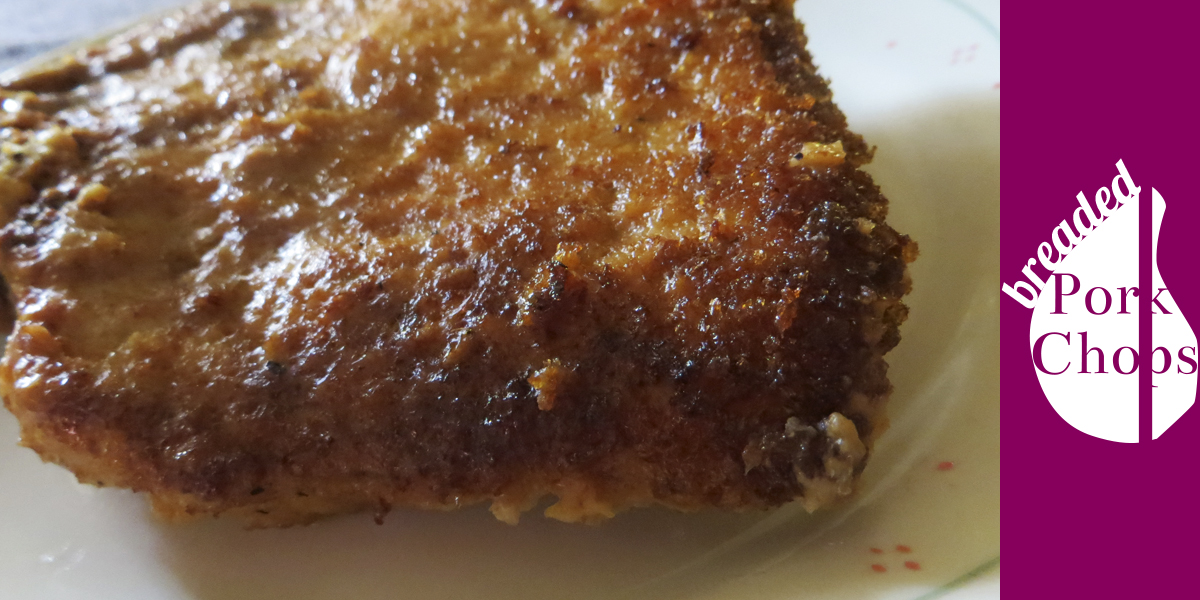 One family recipe that has been pasted down from generation to generation in my family is Breaded Pork Chops. It is a traditional recipe for pork chops that keeps it crispy and moist. Pork Chops can dry out easily when you cook them so having a method where you can always get moist and delicious results is ideal. The family recipe uses a cooking method where you fry it on top of the stove first and then bake it in the oven. When baking in the oven, the dish containing the Breaded Pork Chops has a little water at the bottom to also steam cook the pork chops with of course a lid on the dish.
