Cook. Photo. Eat. Design.

  • Newest
  • Posts
  • Gallery
  • About
  • Contact

October 19, 2015 By Nicholas Dapkus

Ice Cream Dessert

Ice Cream Dessert

Dessert can sometimes be the most important part of any meal so a delicious cold treat is in order. Ice Cream is a top favorite of mine so using that to create a dessert dish to share is a must especially during those hot summer days. Ice Cream Dessert uses any flavor of ice cream and cookies you want with the one I made using Chocolate Chip Cookie Dough Ice Cream and Chocolate Chip Cookies. Another great flavor variation I love for this recipe is using Cookies & Cream Ice Cream (Note: Is my favorite ice cream flavor) with Oreo cookies! It is a simple dessert to make up however it has to setup in the freezer 6 to 8 hours or overnight after making it so a little planning ahead is needed to be able to enjoy this dessert for a specific time.

— —

Sometimes the product alone can sell a design just fine when photographed just right. The Ice Cream Dessert just looks oh so delicious on its own so toke a photo with the dessert at an angle with a black background. The black background was created by using a plain black t-shirt I have since did not have a black surface or table cloth to use. The design layout was the main photo to the right using 75% of the available space and the remaining 25% used for the logo with design elements. The main color scheme taken from the photo was brown in two shades one matching the color of the chocolate syrup while the other matching the cookie crumbs.

Ice Cream Dessert Motif
To give the design area a little more I created a motif that was ice cream inspired since who isn’t inspired by ice cream. At the main core of the motif, is your well know ice cream scoop with the circular scoop head and side lever. The three circles are to represent different types of ice cream; ice cream with swirl like fudge, ice cream with chunks like cookies, and lastly ice cream with multiple flavors like vanilla & chocolate. Motifs can be useful in design but it has to have meaning for it to work so doing your research and brainstorming helps with that. Now the logo was given the ice cream parlor feel by using a font that fits in that style. To add uniqueness, the “I” in “Ice” for the logo was changed to an image of an ice cream cone since when it comes to ice cream that is probably the most well know way of seeing it.

Ice Cream Dessert

Filed Under: Cook. Photo. Eat. Design.

October 18, 2015 By Nicholas Dapkus

Jalapeño Scalloped Corn

Jalapeno Scalloped Corn

A big part of every meal is your sides which there are among thousands of choices to go for. Jalapeño Scalloped Corn is a vegetable side that has a nice creaminess along with a little bite. The side definitely has your vegetable amount with two cans of corn in it so can be a great side to try if you have individuals who struggle to eat their vegetables. When necessary, the jalapeño peppers can be reduced or removed so that anyone can enjoy it just fine if having a bite can be an issue. Another aspect of the side is that it also has a crunch to it since it has Ritz crackers both mixed in and a layer on top. Ever since I made this recipe for the first time it has become a regular side I fix and is great to eat even when leftover on next day.

— —

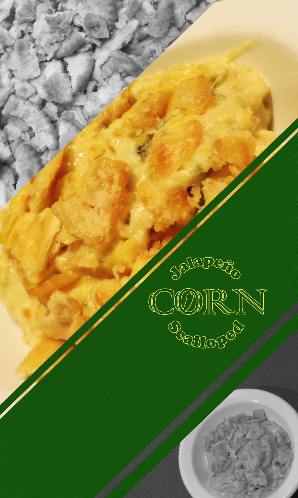
Jalapeño Scalloped Corn has a color scheme of yellow from corn & mixture and green from scallions & jalapeño peppers so that become the color scheme of the design. I created four diagonal bars that would have three using photos and one for the logo. The one for the logo really used the color scheme by giving it a green background since in all the photos you mainly see yellow so had to emphasize that color in at least one bar. Emphasis is an important part for design since you use that to draw the eye of someone looking at it. That is why the middle two bars are in color because one has the main photo for the side and the other is the logo area while the two corner bars are in black & white.

Jalapeno Scalloped Corn

Logo form this time was circular and outline. A circular layout works for the words used since Jalapeño and Scalloped are close to the same length so could use as partial sides of a circle while Corn goes through the middle. Corn is the main ingredient for the side so emphasizing that word in the logo helps give a visual cue of that. In addition to size, the word Corn is given a more stylized font along with a little added image of a jalapeño pepper in the “O” since it is the other main ingredient in the side and name. Words alone can usually be enough for a logo but adding little extra design elements can help it be more unique and have more meaning.

Filed Under: Cook. Photo. Eat. Design.

October 13, 2015 By Nicholas Dapkus

Chili Con Chorizo

Chili Con Chorizo

Chili is one of your most common soups around besides Chicken & Noodle. I have seen many recipes trying different ingredients for whatever taste you like but a variation I love is Chili Con Chorizo. As in the name, the main ingredient used that is different from the normal is using Chorizo Sausage as the meat in the chili. Course one warning, Chorizo Sausage is along the lines of hot and spicy so this chili is on the hot and spicy side so you will have to like food along those lines to enjoy. If you love your hot and spicy food this chili does great when on a hot dog or in chili cheese fries so it is good to take advantage of that when you have some leftover Chili Con Chorizo.

— —

For the design for Chili Con Chorizo, the direction was a gallery approach using four photos and the logo. Four photos meant I needed pictures of other aspects of the chili so what better option then some of the main ingredients of the chili. Your meat is always the star ingredient so instead I focus on the other main ones which are Red & Green Peppers, Onion, and Kidney Beans. Those three ingredients are common in most chilies so felt like the right choices. After chopping up the vegetables, I created the right lighting and placement to get photos of each ingredient and when the chili was cooked placed a serving with an orange background to get a good photo composition. Note the orange background was actually an orange folder, always remember that sometimes the things you already have can work just fine in meeting the end goal of what you want.

Chili Con Chorizo

Layout form was square both for the design as a whole and the logo. The design layout had the photo of the chili as the main with the other photos wrapping around it. The photos wrapping around go in a decreasing length with the top photo full length, the left side photo 75% of length, and bottom photo 50% of length. Logo used the colors of the main chili photo to match but in reverse so main color was the orange and second was red. Now to keep the logo square shape the best option was to turn “Con” sideways and then adjust it to fit perfectly in the area for it and to keep the square composition.

Filed Under: Cook. Photo. Eat. Design.

October 13, 2015 By Nicholas Dapkus

Chicken Cheese Lasagna

Chicken Cheese Lasagna CPED

Lasagna is your main well known Italian dish that usually has Marinara Sauce, Ground Beef or Italian Sausage, Cheese Mixture, and Lasagna Noodles. The classic version is delicious and love it a lot but sometimes changing it up can be just as tasty. This version uses a White Cheese Sauce (very similar to an Alfredo Sauce) and Chicken for the sauce and meat instead so if your love your Chicken and Alfredo combination this is a great recipe to use that combination in a Lasagna. The recipe is completely homemade so sorry no using a jar of sauce to make it easier but come on when it is homemade it always taste better so worth the time and effort.

— —

A common approach for design is to keep things simple, if you do too many things or go overboard what you were trying to do can get lost. For the photograph, the Rule of Thirds is used for composition which is to align points of interest along the lines and points if the photo was divided into three both vertically and horizontally. I may not have a photo studio to create the perfect lighting and background but there is always a way. With moving things around I can create a background that works to get a good composition and use Adobe Photoshop to tweak it some to get a great photo to use. Sometimes with a little work a good or ok photo can be turned into a great photo just give it some time in a photo editor.

Chicken Cheese Lasagna

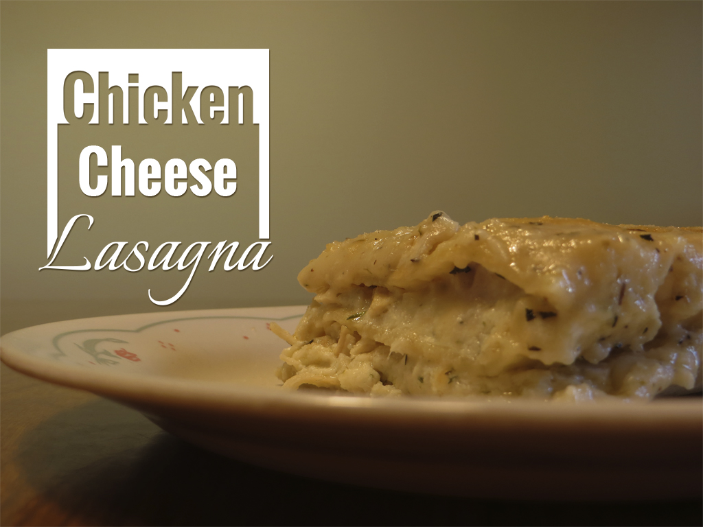
The logo created was using a square layout with the words formatted differently using two fonts. I choose a square layout since Lasagna is generally cut into square/rectangle shape to serve so I wanted to match that. The focus of the logo was to be similar how Lasagna is which is a layered dish with layers being different from one another since one layer will be a noodle then another meat or cheese. So that is the idea here, each word is its own layer and different from the other layers with none the same. “Chicken” was an inverse layer with a solid colored block that has the word cut out of it while “Cheese” was regular with borders to the left and right. “Lasagna” was given a hand writing type of font to make it stylized and increased in size. This logo design was to reflect the dish in both shape and composition which is of course one of thousands of ways to do it.

Filed Under: Cook. Photo. Eat. Design.

  • « Previous Page
  • 1
  • …
  • 5
  • 6
  • 7

Copyright © 2025 · Nicholas Dapkus · Cook. Photo. Eat. Design.