Cook. Photo. Eat. Design.

  • Newest
  • Posts
  • Gallery
  • About
  • Contact

June 25, 2016 By Nicholas Dapkus

Strawberry Shortcake Bars

Strawberry Shortcake Bars

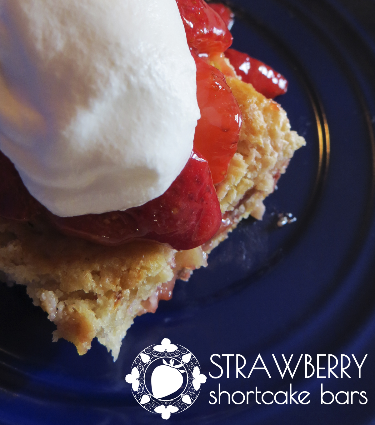
Summertime is a great time for cool and refreshing fruit desserts. Strawberry Shortcake Bars is a scrumptious dessert recipe I found that sounded so tasty I had to try it. The main ingredient in the dessert is of course strawberries and triples it with strawberries mixed in the shortcake, a layer of strawberry jam, and strawberries in the topping. For the shortcake part of the dessert, the cake is actually more along the lines of a biscuit than your usual cake. One ingredient that is in the shortcake that helps boost what makes this dessert so appealing is white chocolate.

— —

In celebration of 4th of July it was ideal to do a photo that has the red, white, and blue colors. Strawberry Shortcake Bars already had my red from the strawberries and white from the whipped cream on top so needed some blue. Luckily, I had access to a blue serving plate so was able to have a good representation of the 4th of July colors. After taking the photo I cropped out the extra background to focus only on the dessert and only have the blue plate in the background since originally you could see the counter the plate was on some.

Strawberry Shortcake Bars

The logo style used this time around was simple lettering with a motif graphic of the main ingredient strawberries. For the motif, a circular structure was used with a ring and a detailed silhouette of a single strawberry in the middle. The ring uses imagery of strawberries, strawberry plant leaves, and planet vines to keep with the main theme of the motif. In the lettering, the use of capitalization for text became the tool to help emphasis words with “Strawberry” in uppercase while “Shortcake Bars” in lowercase.

Filed Under: Cook. Photo. Eat. Design.

June 3, 2016 By Nicholas Dapkus

Warm Rocky Road Cake

It was time for a new challenge with the focus on using a crock-pot. Warm Rocky Road Cake is baked in a crock-pot and can be kept warm when serving since can leave in the crock-pot on a warm setting so it does not cool down. The cake is on the big side so takes a 5qt or 6qt crock-pot to make it in but time wise it only takes 3-4 hours for baking. After baking, you top it with marshmallows, chocolate chips, and pecans so that they melt only a little then when it is time to serve having it with ice cream can be deliciously ideal.

— —

Warm Rocky Road Cake is similar to lava cakes and hot fudge cakes so is more on the liquid side then a regular cake. So for plating, the dessert had to be in a bowl with the topping the focus on what you see. It was placed in a colorful green bowl so that the photo would have a bit more color since the dessert is mainly black and brown. A plain gray background was created with some texture by using one of my T-Shirts. Lighting was only one somewhat harsh source from the right since you get a pretty defined shadow and only the top part of the dessert has enough light.

Warm Rocky Road Cake

The object with the Warm Rocky Road Cake logo was to keep it simple with only defining parts is font and placement. Since “Warm” was more of just a descriptive word where the rest was defining what the dessert is, that separation was used to define font difference and placement. “Rocky Road Cake” was given a serif font and placed in a kind of jagged diagonal order to emphasize the meaning of the word “Rocky”. While the “Warm” was given a handwriting style font and placed partly in the word “Rocky” between the “R” and “k” to help facilitate that the word “Warm” was describing an aspect of the dessert.

Filed Under: Cook. Photo. Eat. Design.

May 16, 2016 By Nicholas Dapkus

Southwestern Salmon Cakes with Chipotle Mayo

Southwestern Salmon Cakes with Chipotle Mayo

My first ever seafood dish I cooked is Southwestern Salmon Cakes with Chipotle Mayo and it was worth trying something new along with was in an area I am not familiar with. Seafood is not an area I am strong with or something I am familiar with cooking dishes with seafood ingredients but decided to challenge myself with finding a delicious recipe to try. Southwestern Salmon Cakes with Chipotle Mayo is a dish I enjoyed tremendously and have added it to the rotation of dishes I fix on a regular basis. As you can guest by the name, the entree has a little heat to it since one main ingredient is Chipotle but not overwhelming unless you dip/cover it in the Chipotle Mayo a lot. It is a delicious recipe for anyone looking for a different way to fix Salmon or try a seafood recipe if not too familiar with cooking dishes with ingredients like Salmon.

— —

Southwestern Salmon Cakes with Chipotle Mayo is a glorious looking entree and has the dip to go with it so has added items for plating. After cooking up the Salmon Cakes, the goal was plating at least two on a plate on one side and the Chipotle Mayo on the other side. To finish off the plating was adding a fork which for photography you generally want to have a fork face down since when like that there is less of a chance of image or light reflections that could ruin the image. The fork is also used as an eye line since it helps lead the eyes to focus on the entree. One effect used on the photograph was a black and white filter on the bottom part to remove color so the focus was more on the area in color along with softening the light reflections from the fork so that the eye would not be drawn to the fork instead of the entree.

Southwestern Salmon Cakes with Chipotle Mayo

The main challenge was creating a logo that uses the long entree title of Southwestern Salmon Cakes with Chipotle Mayo. After sketching a few design concepts, the best option was using the circular shape of the entree as the logo shape and having the descriptive words as part of the circular shape. Using a two font setup, the important words to focus on was Salmon Cakes since that tells you what kind of dish this is so an elegant handwriting font was ideal with words in the the circular ring using a serif font type. The last design element was to add a silhouette of a salmon to help give a visual cue of this being a seafood type of dish.

Filed Under: Cook. Photo. Eat. Design.

May 4, 2016 By Nicholas Dapkus

Chicken Kiev

Chicken Kiev

A delicious recipe I constantly enjoy is a stuffed chicken recipe, Chicken Kiev. Generally, Chicken Kiev is a herb and butter stuffed chicken but the recipe I love adds a bit more inside with the addition of cheddar cheese. It can be a bit difficult dish to make with the flattening of the chicken, stuffing the chicken, and then keeping it together to roll in breadcrumbs but it is a worthwhile dish since is mouthwatering yummy. An advantage of Chicken Kiev compared to other chicken recipes I learned is with the stuffed ingredients they help keep the chicken and dish as a whole moist so you always end up with a nice and tender entree to enjoy.

— —

Chicken Kiev looks like most breaded chicken dishes on the outside so the important part is to focus on the one main difference, the ingredients stuffed within the chicken. So for photography, the first step is plating the dish with a nice cut down the middle of the chicken and then both parts at an angle you can see what is inside. Course, I had to make sure to do this when it just came out of the oven so that you can get some nice gooey cheese oozing out to show the dish looking delicious.

Chicken Kiev

For the logo, the goal was to keep it simple since it was going to be used with a 3D effect. The best option that worked for the title Chicken Kiev was using a different font for each word and then doing a stacked look with it looking like the word “Chicken” is sitting on top of the word “Kiev”. Now for the hard part, creating a 3D effect is not the easiest but can give a good look when done right. The 3D effect I went for was if the text was sitting on the plate to name the dish. So the process became to give the text good shape and material so it looked like a white metal block of text placed on the plate. The next step was lighting and shadow for the text block to match what was in the photograph. The main part was the shadow since there were two light sources thus giving two shadows: a dark close shadow and a lighter shadow. So, I had to create two shadows that match how they were for the other items on the plate which meant matching directions of shadow, placement to the item, color, and how dark of a shadow.

Filed Under: Cook. Photo. Eat. Design.

March 21, 2016 By Nicholas Dapkus

Apple – Cream Cheese Bundt Cake

Apple - Cream Cheese Bundt Cake

Well it was time for some cake, so baked an Apple-Cream Cheese Bundt Cake! Apple type cakes are always a delicious treat so when I found this interesting recipe I had to try it and now it is a new favorite dessert of mine. The cake itself has a wonderful taste with some ingredients like brown sugar, cinnamon, nutmeg, and toasted pecans that give it a great flavor along with both applesauce and fresh apples for an appealing apple flavor. However, the two aspects of this dessert that makes it extra yummy are the cream cheese filling and praline frosting. Praline frosting is a brown sugar base frosting so for a recipe like this the taste of the frosting works wonderful with the cake.

— —

Photography this time was to focus on different parts of the dessert. So the base design layout needed three photos to work so the question began what to show in the three photos. The end result was the cake as a whole, the interior of the cake when cut so to see the cream cheese filling, and the scrumptious toppings of the praline frosting with chopped toasted pecans. These three photos showed aspects of what the dessert is and what makes it alluring for someone to want to eat it. To emphasis the bundt cake shape, the three photos appear through half of the bundt pan circular shape. A small extra to the bundt cake shape was to incorporate the action of getting a slice of cake with a slice being removed on the right side.

Apple - Cream Cheese Bundt Cake

Apple – Cream Cheese Bundt Cake has more in terms of words and length than usual so that was the main challenge with designing this logo. The best option was grouping and a layered layout, the division in the words made the most sense with creating two groups of one being “Apple – Cream Cheese” and the other “Bundt Cake”. “Apple – Cream Cheese” describes what the specific flavor and ingredients for the cake are while “Bundt Cake” tells us what type of dessert it is. The layout was to mimic the display of a cake with “Apple – Cream Cheese” on top where the cake is located and “Bundt Cake” as part of the cake stand. The main shape of the cake stand uses the “T” in bundt as the pillar/handle piece connected to the platter. The last part for the logo design was the fonts with the top part using a handwriting type font to convey the beauty of the dessert and the bottom part a bold sans-serif font so that there was little white space between letters.

Filed Under: Cook. Photo. Eat. Design.

  • « Previous Page
  • 1
  • 2
  • 3
  • 4
  • 5
  • 6
  • 7
  • Next Page »

Copyright © 2025 · Nicholas Dapkus · Cook. Photo. Eat. Design.